

In mid-2025, two Tampa, FL-based organizations: Gracepoint Wellness and Cove Behavioral Health merged to form Ibis Healthcare, a new, unified source for comprehensive healthcare and wellness services. Together, they now provide an end-to-end continuum of care, including primary care with on-site labs and pharmacy, mental wellness services, recovery support, affordable housing, and specialized programs for children and teens.
Hum & Flow was brought in to help name and visually brand this new organization, creating an identity that would honor the merger while positioning the organization as a trusted, future-facing provider for the community.
Rebranding Project Goals:
The merger presented a unique challenge: how to create a new brand that felt equally representative of both legacy organizations, while standing on its own as bold, fresh, and compelling. The identity needed to communicate trust, resilience, and care while embracing the organization’s unique ability to offer a full continuum of services under one umbrella.
Key Deliverables:
- Naming and identity system for Ibis Healthcare
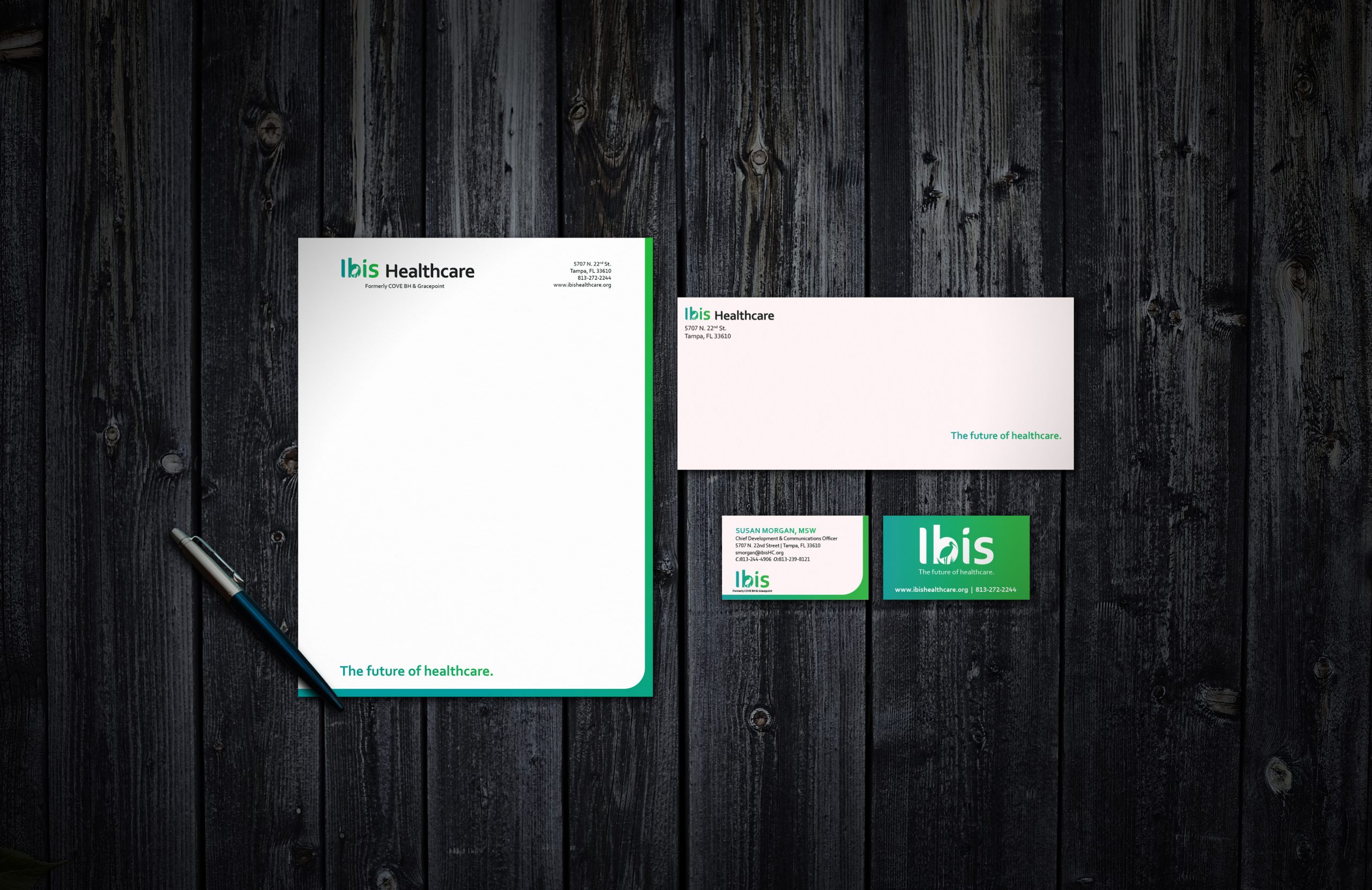
- Full logo suite
- Bold brand color palette and gradient system
- Typography system and brand texture
- Comprehensive brand guidelines for consistent use
- Coordinated rebranding of the fundraising arm as the Ibis Healthcare Foundation

Breaking Down Our Rebranding Process
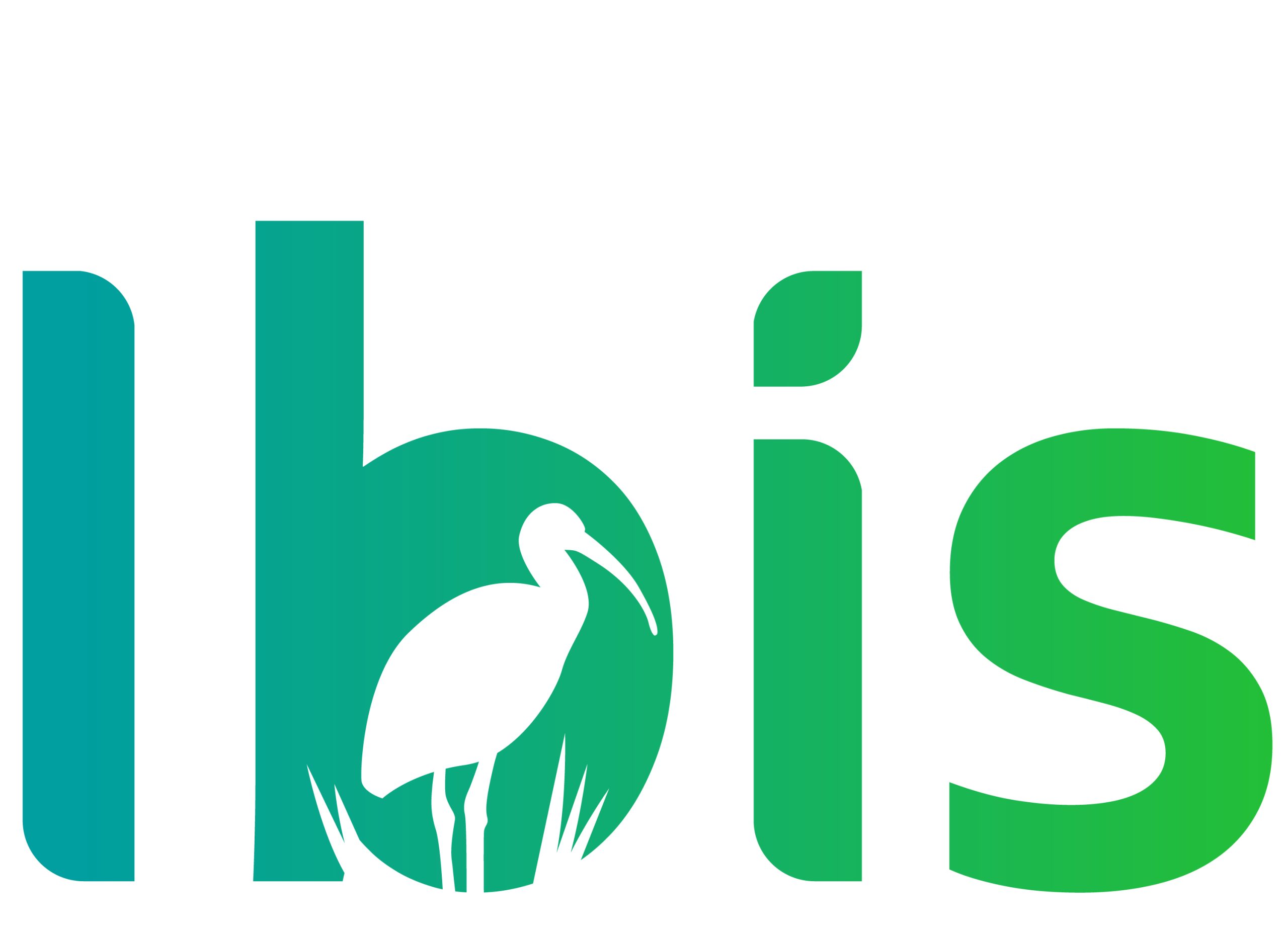
Our work began with a broad naming exploration, where we developed a range of options spanning from the literal to the abstract. The name Ibis Healthcare quickly rose to the top. The ibis is an iconic bird native to Florida, a symbol of resilience, strength, and community—qualities that perfectly mirrored the new organization’s mission.
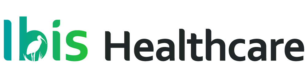
From there, we moved into visual identity development. The final logo suite included vertical, horizontal, and simplified variations to ensure flexibility across applications. A bold, vibrant gradient became the hallmark of the identity, symbolizing the continuum of care that Ibis provides. This was paired with a carefully chosen typography system, a modern brand palette, and a textured graphic element that gives the identity depth and dimension.
One of the project’s biggest challenges was navigating the perspectives of multiple stakeholders from two merging organizations. Through thoughtful collaboration, we distilled those voices into a unified brand that felt both natural as an evolution of either legacy organization and new enough to stand independently.
Defining a bold and vibrant color palette
The color palette for Ibis Healthcare is led by a distinctive pair of bold and vibrant shades of blue and green, supported by dark and light options for neutral shades.
Ibis Egg Blue
RGB: 0/159/159
CMYK: 80/16/40/0
#009F9F
Ibis Green
RGB: 35/190/56
CMYK: 75/0/100/0
#23BE38
Ibis Dark Grey
RGB: 32/38/38
CMYK: 75/64/64/70
#202626
Ibis Light Grey
RGB: 247/247/247
CMYK: 2/2/2/2
#F7F7F7
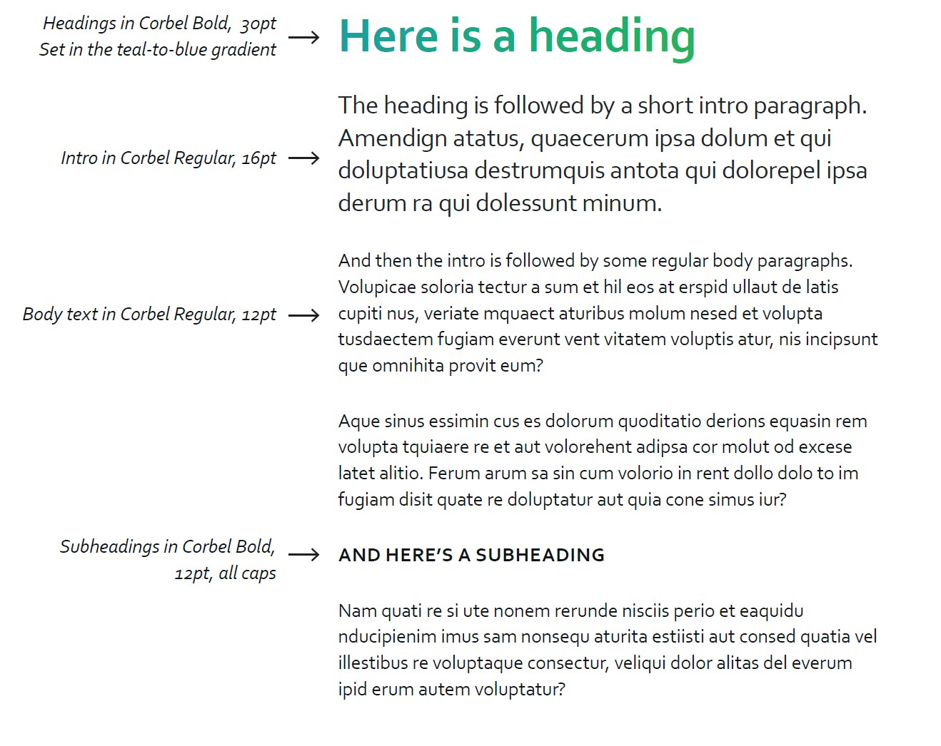
Defining an Updated typographic system for the rebranded organization
Early on in the process, the Ibis Healthcare team identified the need to base the typography system around a font face that was easily accessible. We landed on Corbel for its clarity, versatility, and its availability across Windows devices.


“Hum & Flow has been an indispensable extension of our team and our organization’s branding and revenue development efforts.”
-Leia Bell, M.A., M.S.
Chief Impact Officer and Executive Director
Ibis Healthcare Foundation
Results
The result is a bold, future-facing brand identity that reflects both the strength of the organization’s legacy and its commitment to serving the community in new and expanded ways.
Ready for your brand to take flight?
Contact us today to schedule a consultation and discover how we can bring your brand to life.