
In this book design case study, we break down how we crafted the quite creepy Haunted New England series for Paranormal Printing. This book series delves into the rich tapestry of ghost stories, haunted locations, and unexplained phenomena across various counties in New England. Each book offers a town-by-town exploration of these mysterious tales, aiming to captivate readers interested in the paranormal and regional history.
Book Design Project Goals:
Attract Attention: Develop eye-catching covers that stand out, especially in online marketplaces where thumbnail images are critically important.
Set the Tone: Establish the appropriate visual aesthetic that reflects the eerie and mysterious content within.
Ensure Consistency: Maintain a uniform design across all titles in the series while allowing flexibility to accommodate varying story lengths and content.
Key Deliverables:
Cover Designs: Distinctive and evocative covers for each title in the series, utilizing a consistent illustration style that aligns with the paranormal theme.
Interior Layouts: Thoughtfully designed interiors featuring appropriate typography and illustrative elements that enhance the storytelling experience.

creating compelling Cover Designs
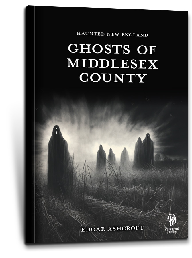
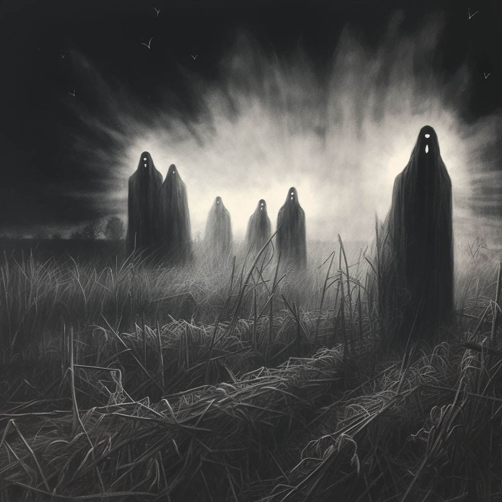
Recognizing the critical role of book covers in attracting readers, we employed an appropriately dark and mysterious aesthetic leaning heavily on stark black and white and moody illustrations. This approach not only set the desired creepy tone but also ensured that the covers remained effective and memorable, even at small sizes.
Balancing bold illustration against terrifying Tales
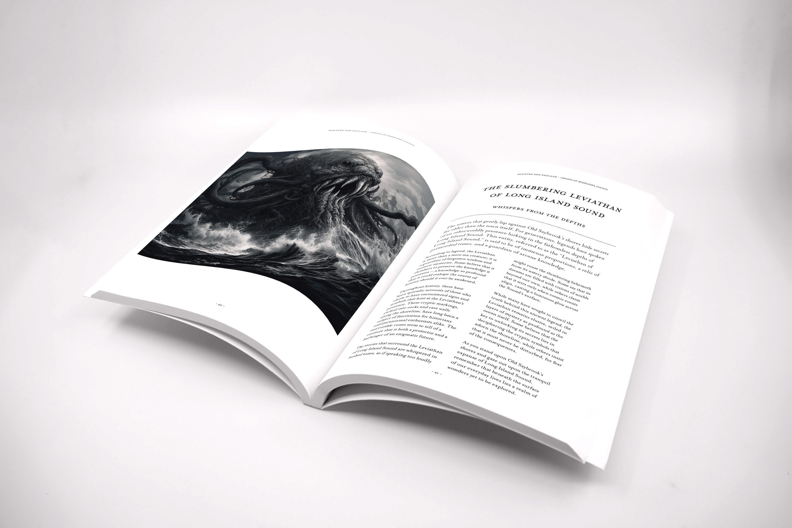
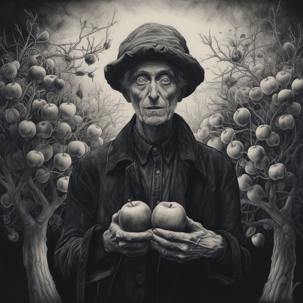
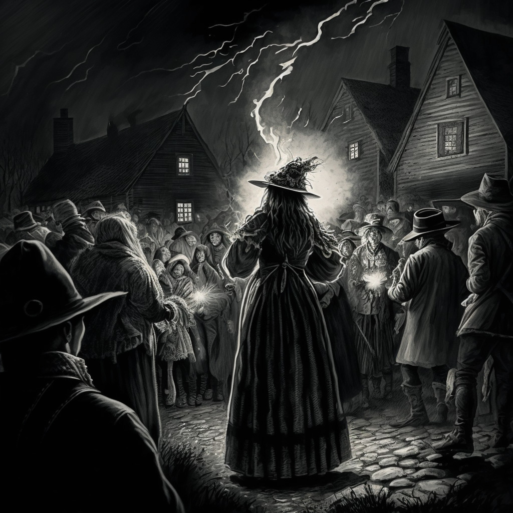
Inside the books, each section pairs textual content with large, richly detailed black-and-white illustrations that bring each ghost story to life. Typography choices lend the books a classically authoritative and historic feel, drawing readers into the past and imbuing the tales with an air of mystery.

Art directing the illustrations to draw the reader in to each twisted tale
To keep the reader engaged from cover to cover, the series’ artwork draws inspiration from the chilling, shadowy illustrations found in timeless horror literature—evoking the kind of imagery that made classic ghost stories so haunting. Our goal in art directing the illustrations was to strike a balance between eerie ambiguity and atmospheric detail, leaving just enough to the imagination to amplify the sense of mystery.
To further ground the stories in their regional setting, the illustrations intentionally incorporate distinctly New England elements—weathered lighthouses, colonial-era houses, and fog-drenched cemeteries. By weaving in this recognizable iconography, the books pay tribute to the unique character and flavor of the region.


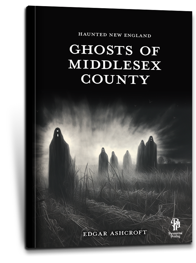
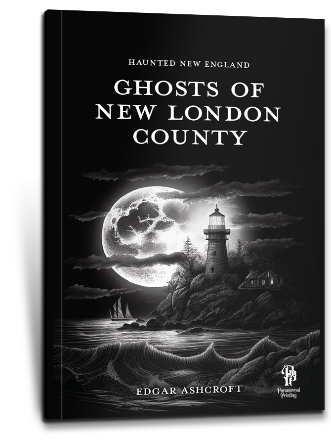
Given that each book focuses on a different county with diverse stories, it was essential to define a consistent style. This consistency was achieved through uniform typography, layout structures, and illustration styles, providing a cohesive identity across the series while retaining flexibility for varied content.
The cohesive design strategy resulted in a book series that effectively captures the eerie essence of New England’s haunted tales. The consistent yet flexible design approach allows each book to stand on its own while clearly belonging to the “Haunted New England” series. This unified aesthetic not only enhances the visual appeal but also strengthens the series’ brand identity in the market.
Ready for your brand to take flight?
Contact us today to schedule a consultation and discover how we can bring your brand to life.